


Walter Price: Pearl Lines at Camden Art Centre, London
- Posted:
- Friday dispatch
- Type:
- Read Time: 4 minutes

What a joy to be back in the airy galleries of Camden Art Centre, and the warm weather has made a lush, green oasis of its gardens.
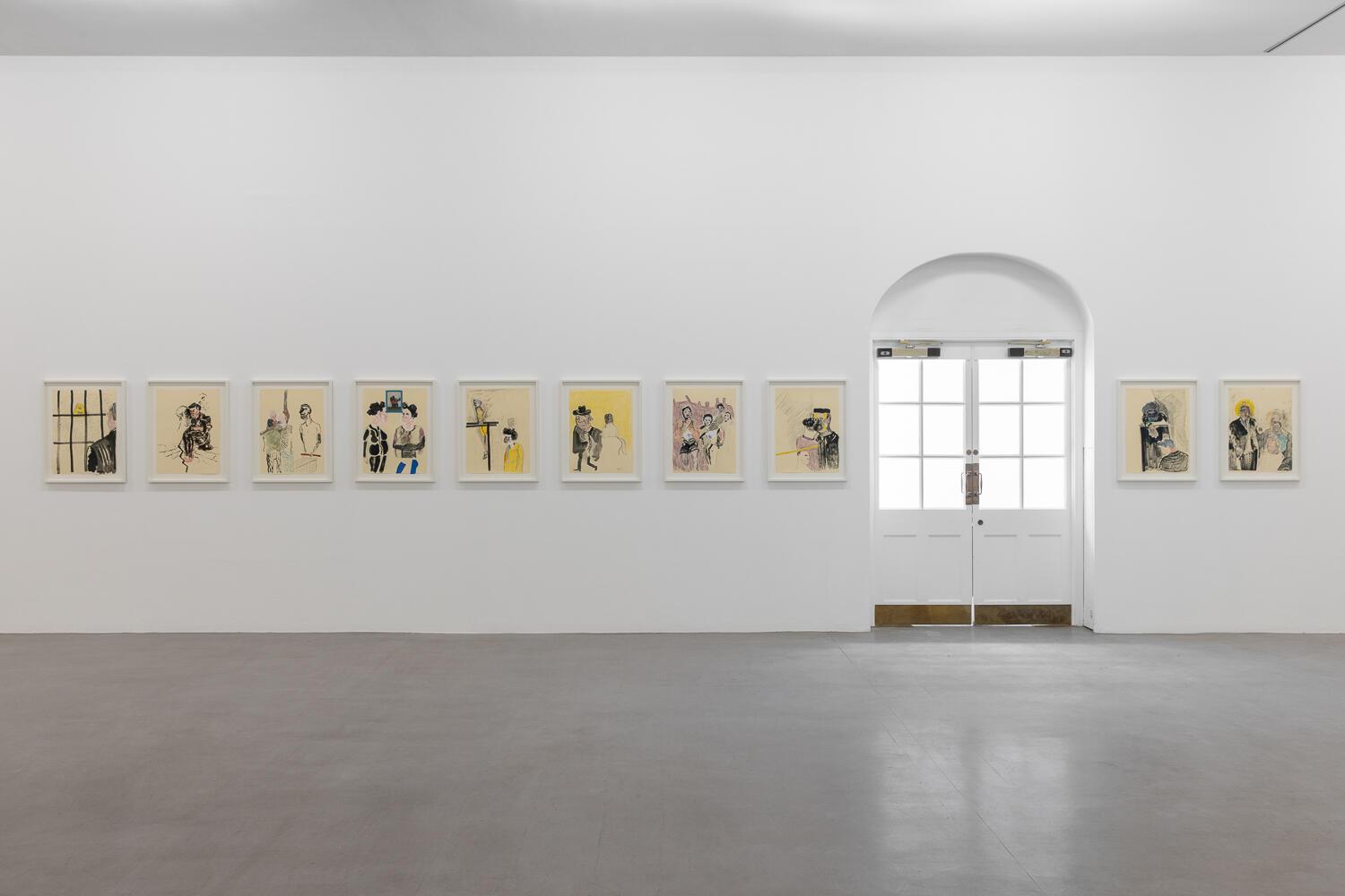
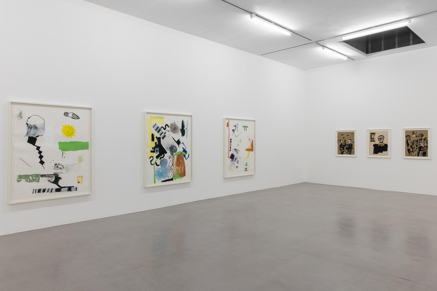
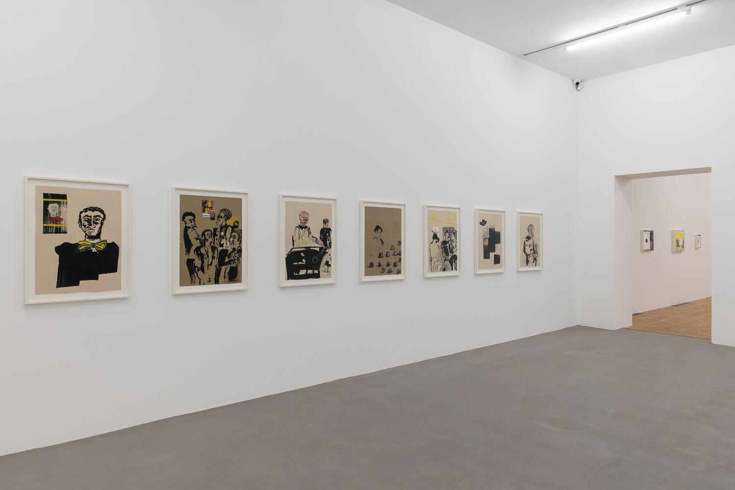
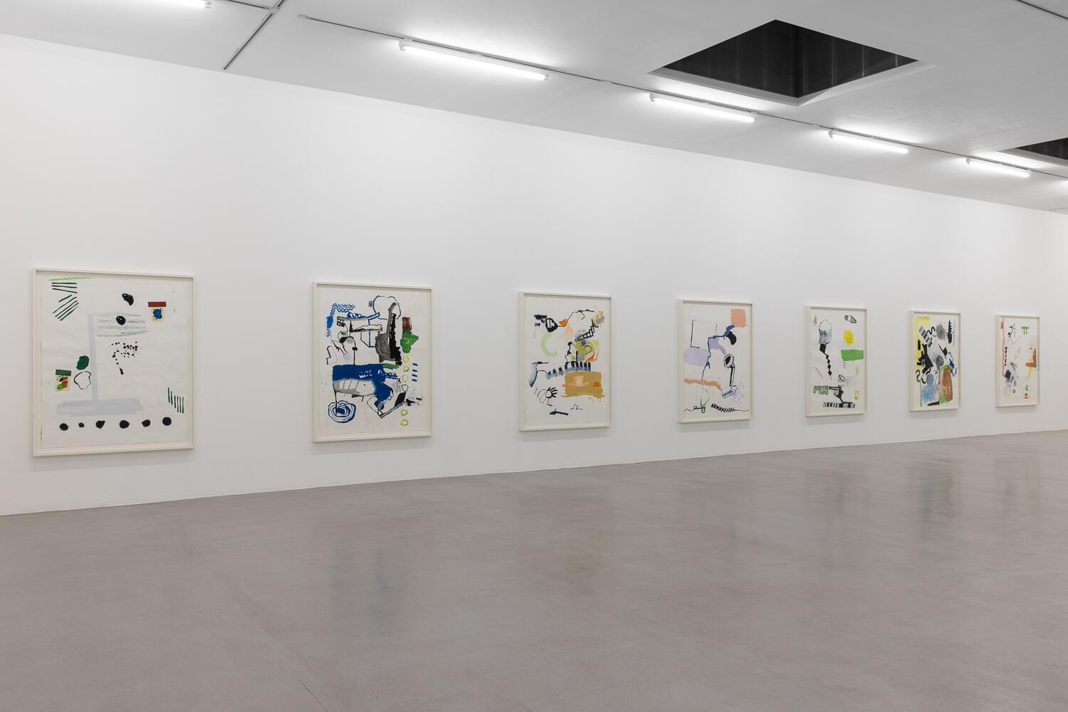
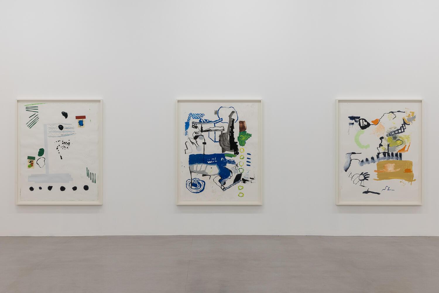
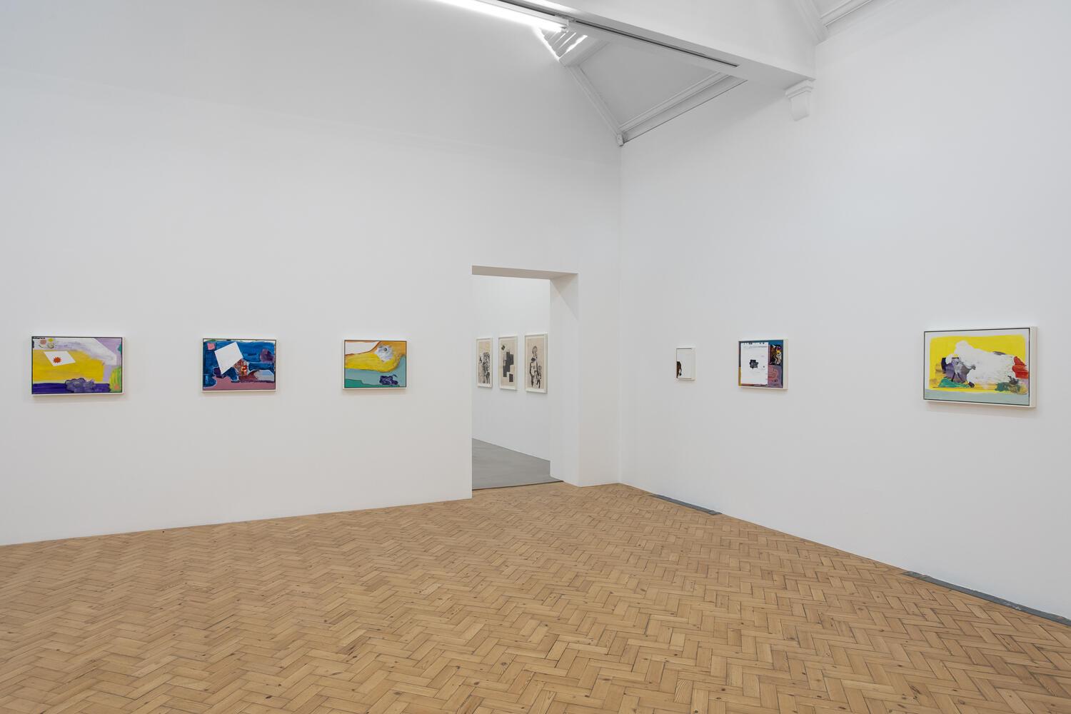
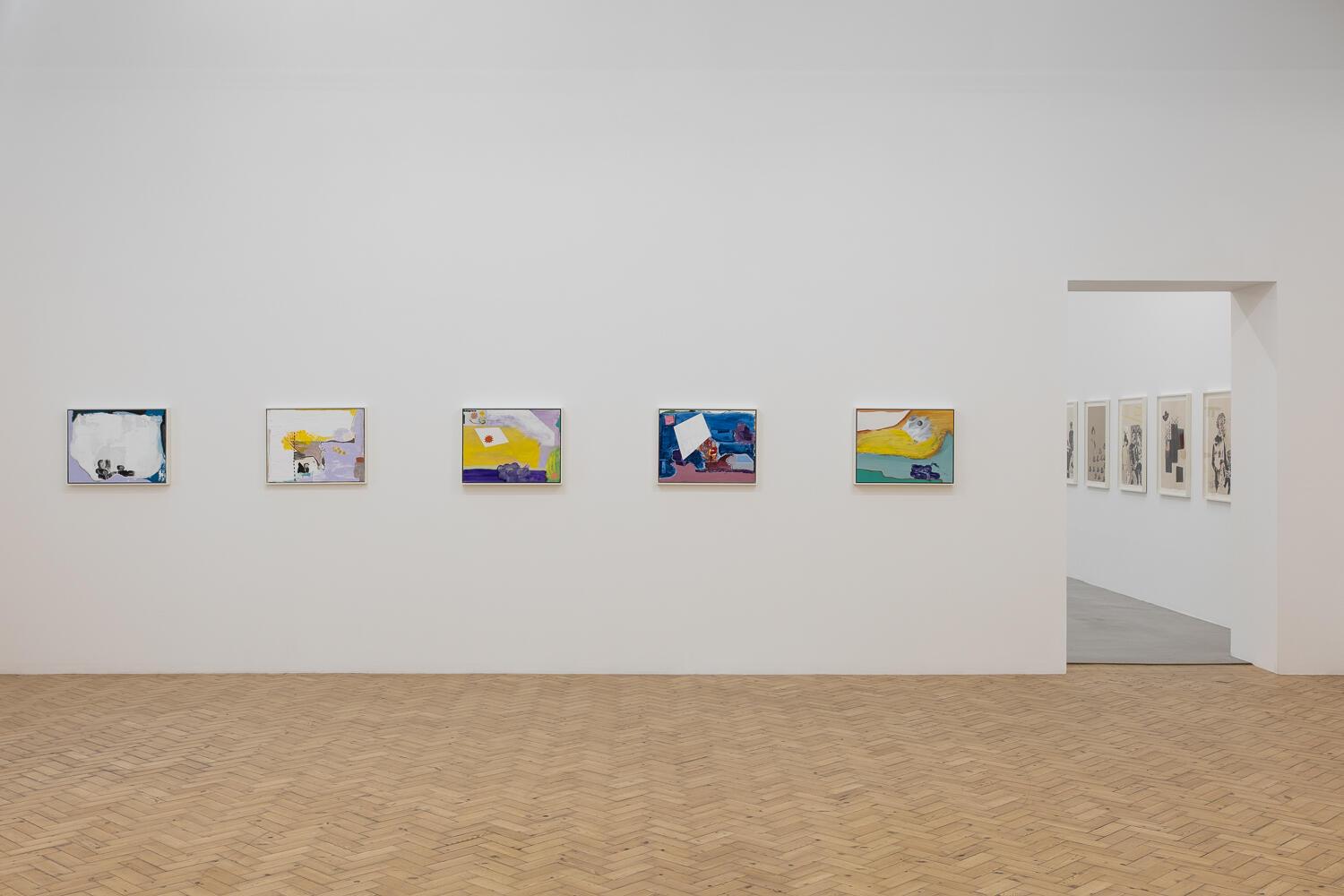
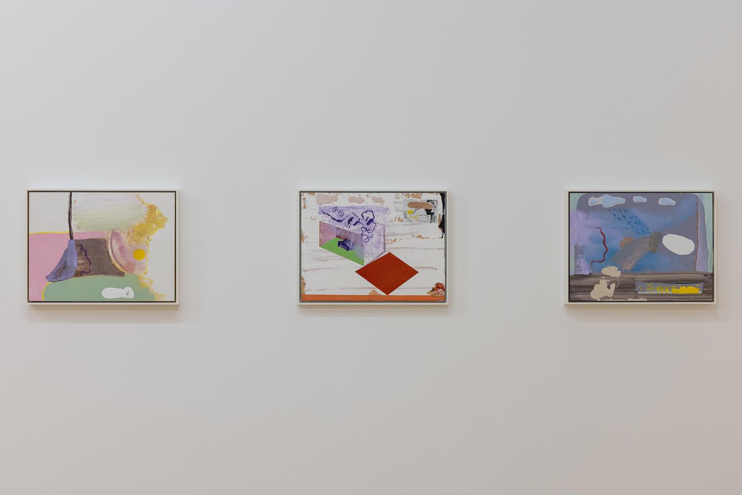
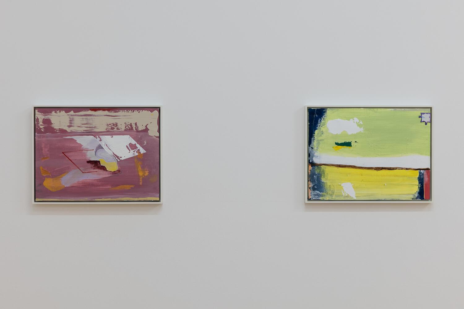
Though he has shown extensively in the US and had several exhibitions at The Modern Institute in Glasgow since 2016, this is the first time Walter Price has had an institutional solo show in the UK. Reflecting the generative quality of the wider programming at Camden, Price was in residence here in 2020. Now he has filled Gallery One with 27 works on paper and the smaller Gallery Two with 19 canvasses, giving viewers new to his work the opportunity to immerse themselves in his visual world.
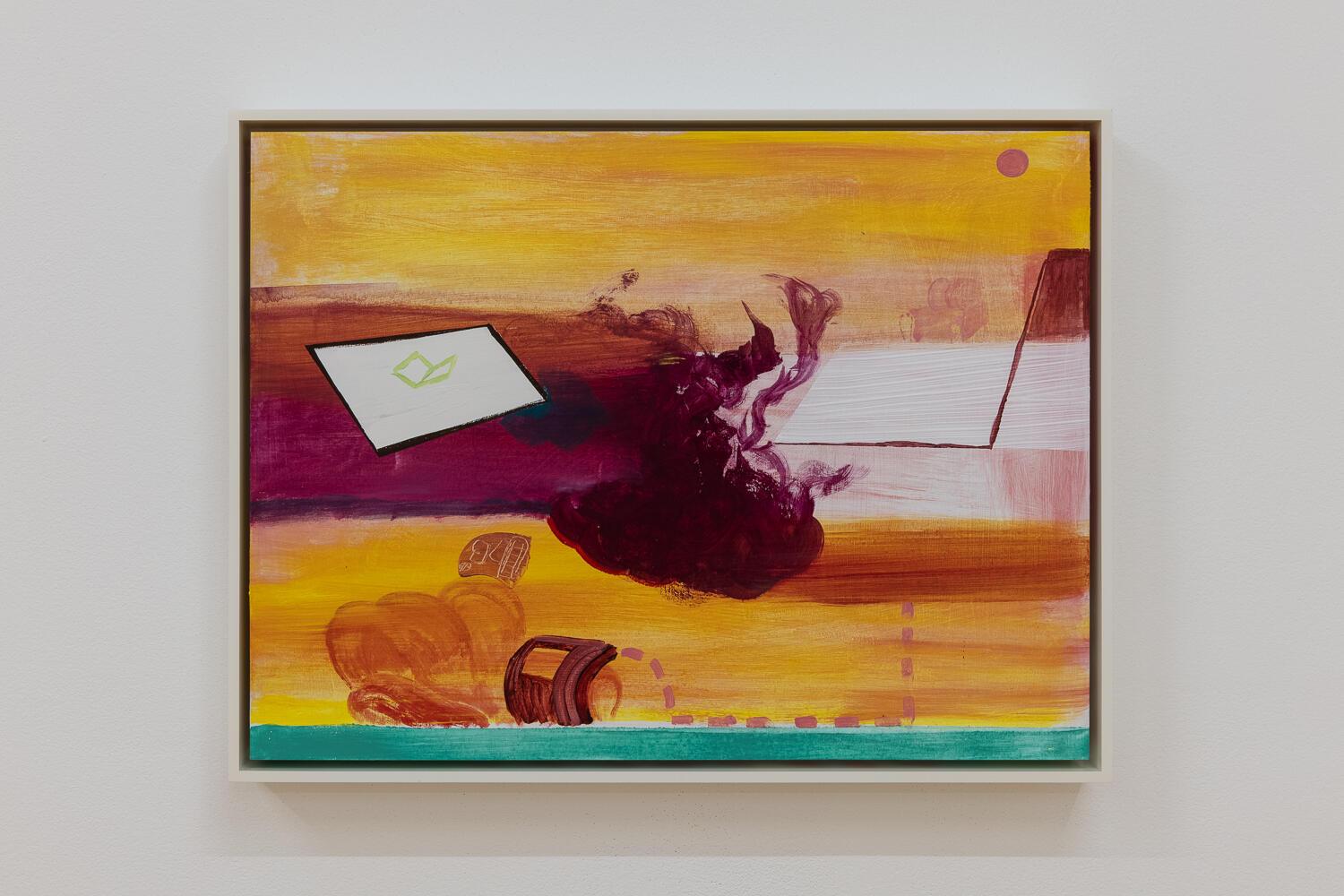
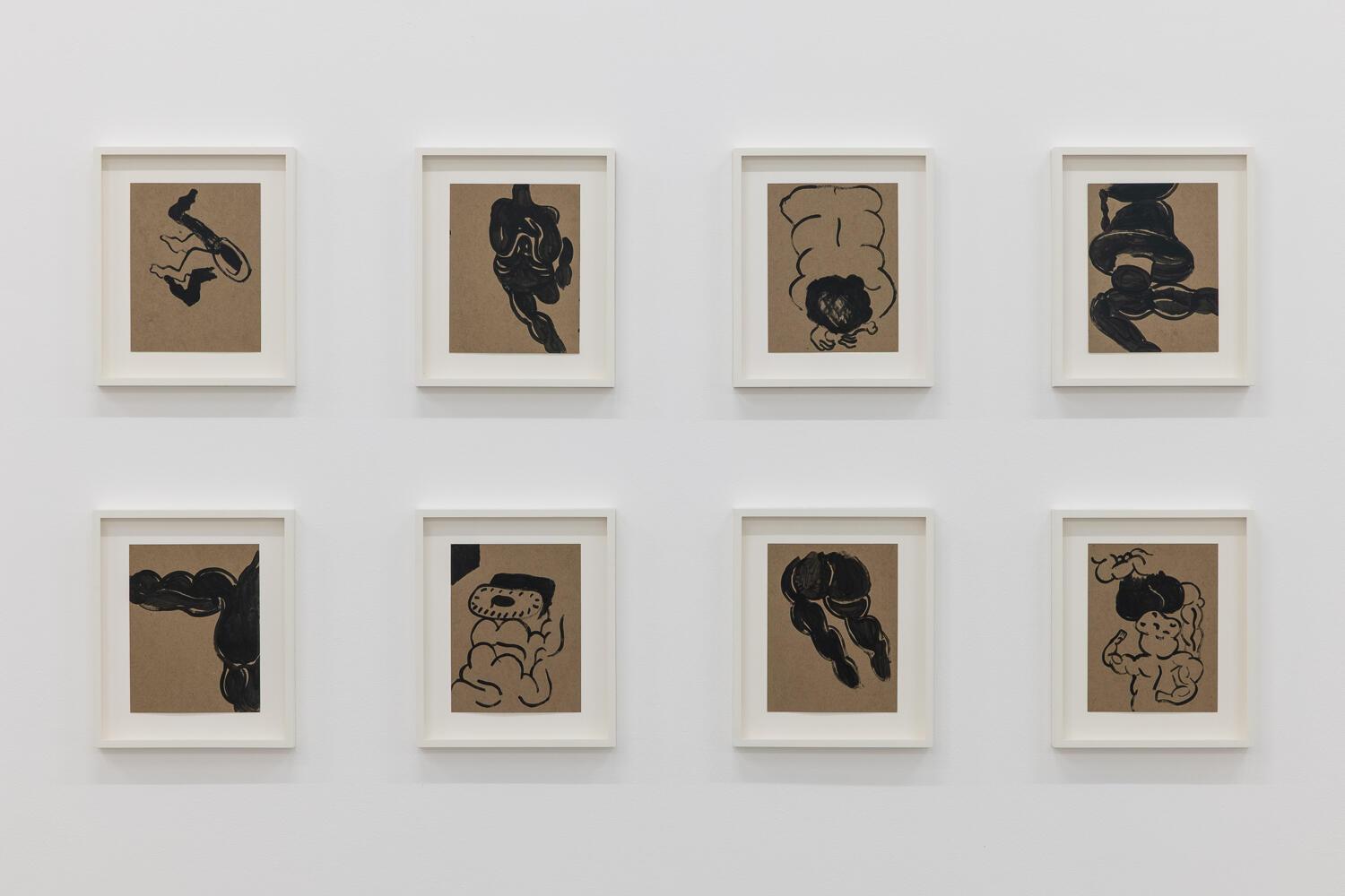
All the works here are dated 2020, made during the lockdowns of last year, when the artist chose to work only with the materials he had in his studio at the time. Eking out colour with an abundant supply of white paint, this has produced a paler, more pastel palette than has been seen before. It is the kind of self-imposed rule that might be understood as characteristic of an artist who funded his way through art school by joining the US Navy, an experience he often cites as having given him an invaluable sense of discipline.
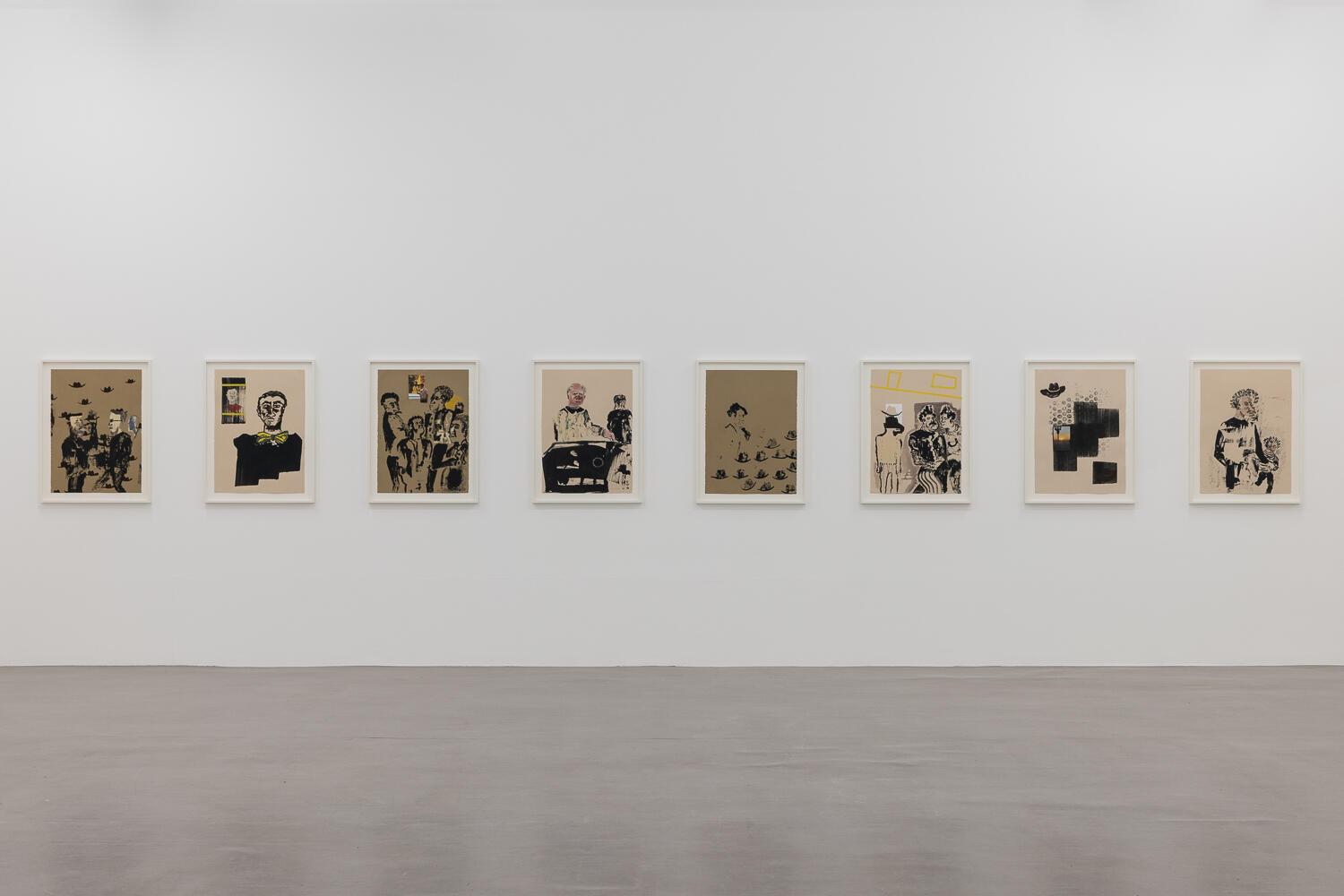
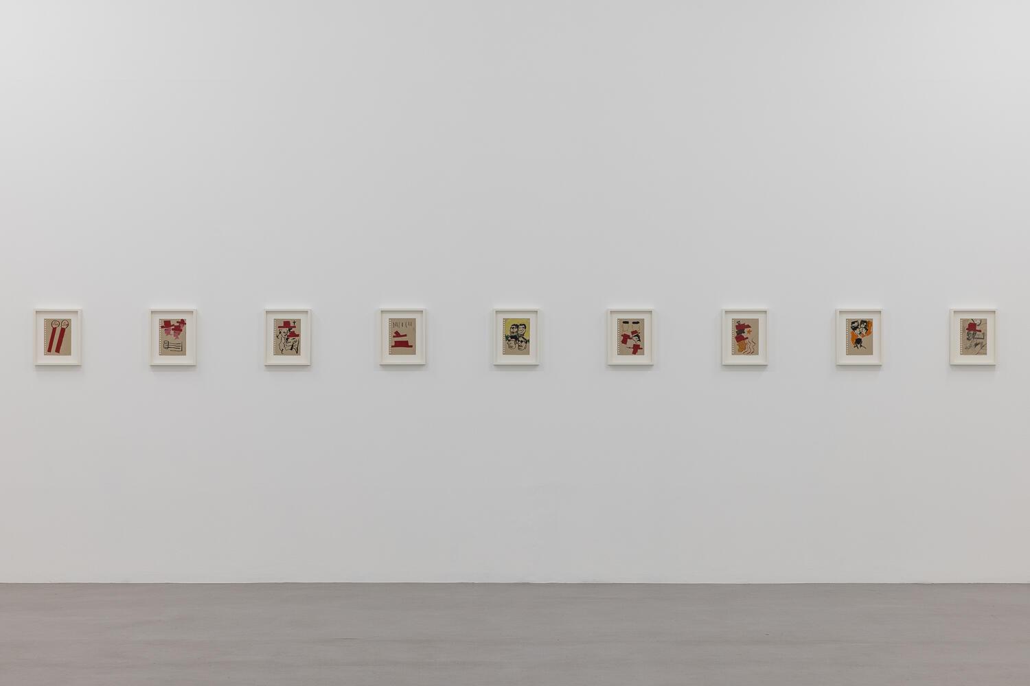
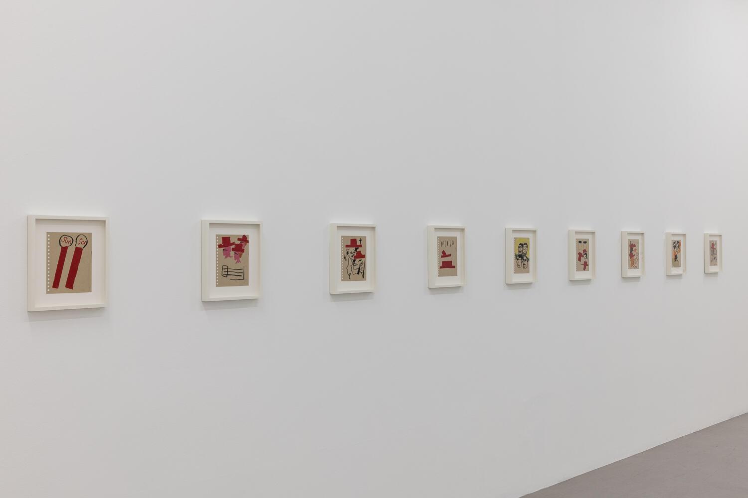
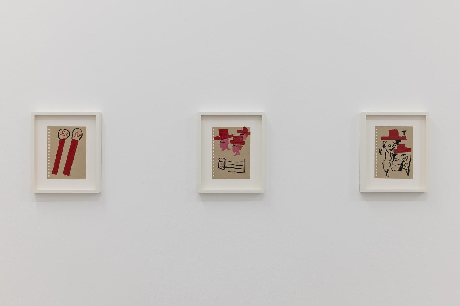
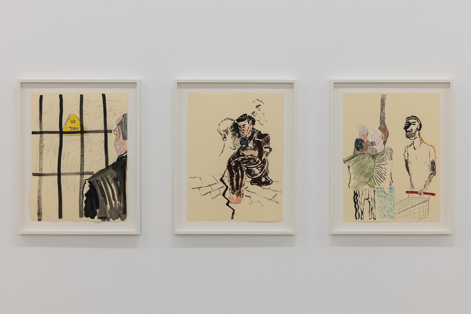
The works on paper are densely hung, something that allows the viewer to track closely the repeating motifs and techniques. Figurative and abstract forms co-exist in a way that produces extraordinarily dynamic compositions. There is a playfulness, a lightness of touch both formally and intellectually, that challenge the viewer to be as nimble. Along the first wall, little stacks of red tape feature, faces drawn underneath to make them read as wide-brimmed hats. Perhaps Stetsons, since there is also a strand of Western iconography here too. Further along, a drawing of an encounter between two serious looking dudes has Stetsons fluttering above them like a flock of birds.
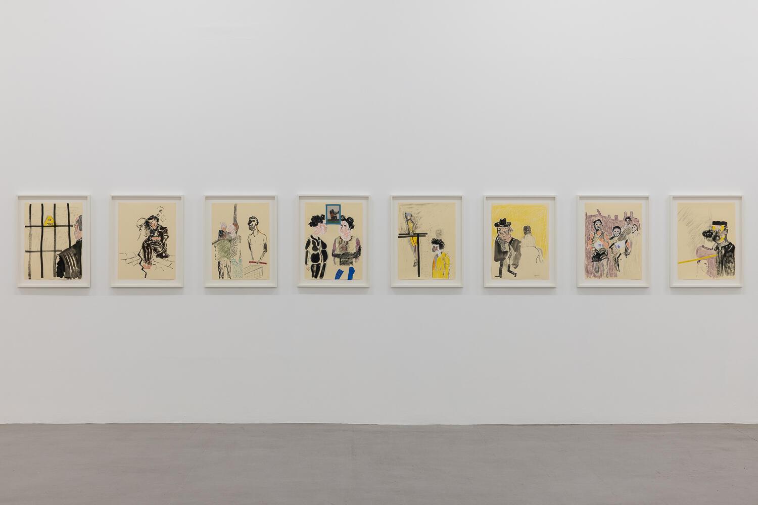
There is linguistic play too. I loved the drawing of a pair of matches one labelled “sun” and the other “son”. It put me in mind of the word play of the European surrealists, exiled to New York during the Second World War and gleefully playing with a new language. Price is very good with titles, which are anything but descriptive but rather produce another layer of dynamic tension in each work: Move along your way as the days become a daze. The group of acrylic on paper drawings called Bod deese deconstruct the human form in thickly black outlines, just as effectively as the artist ruptures your easy expectations with his manipulation of words. This is not the first time Price has called a show Pearl Lines either, he enjoys the ambiguity of it and the way it makes space for the visitor to find their own way to the work.
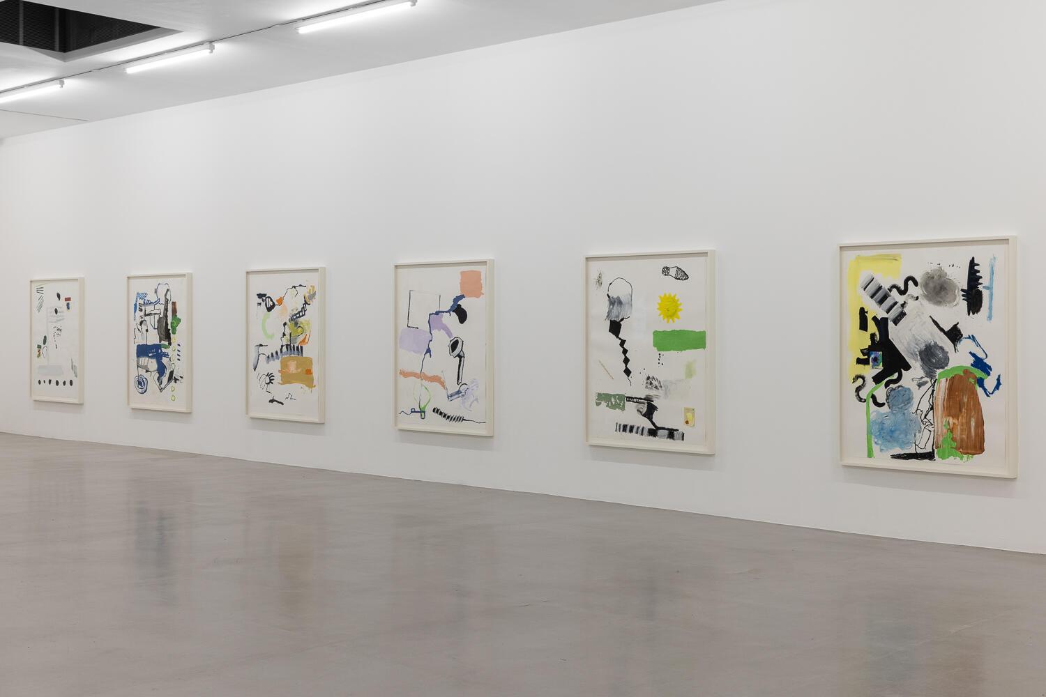
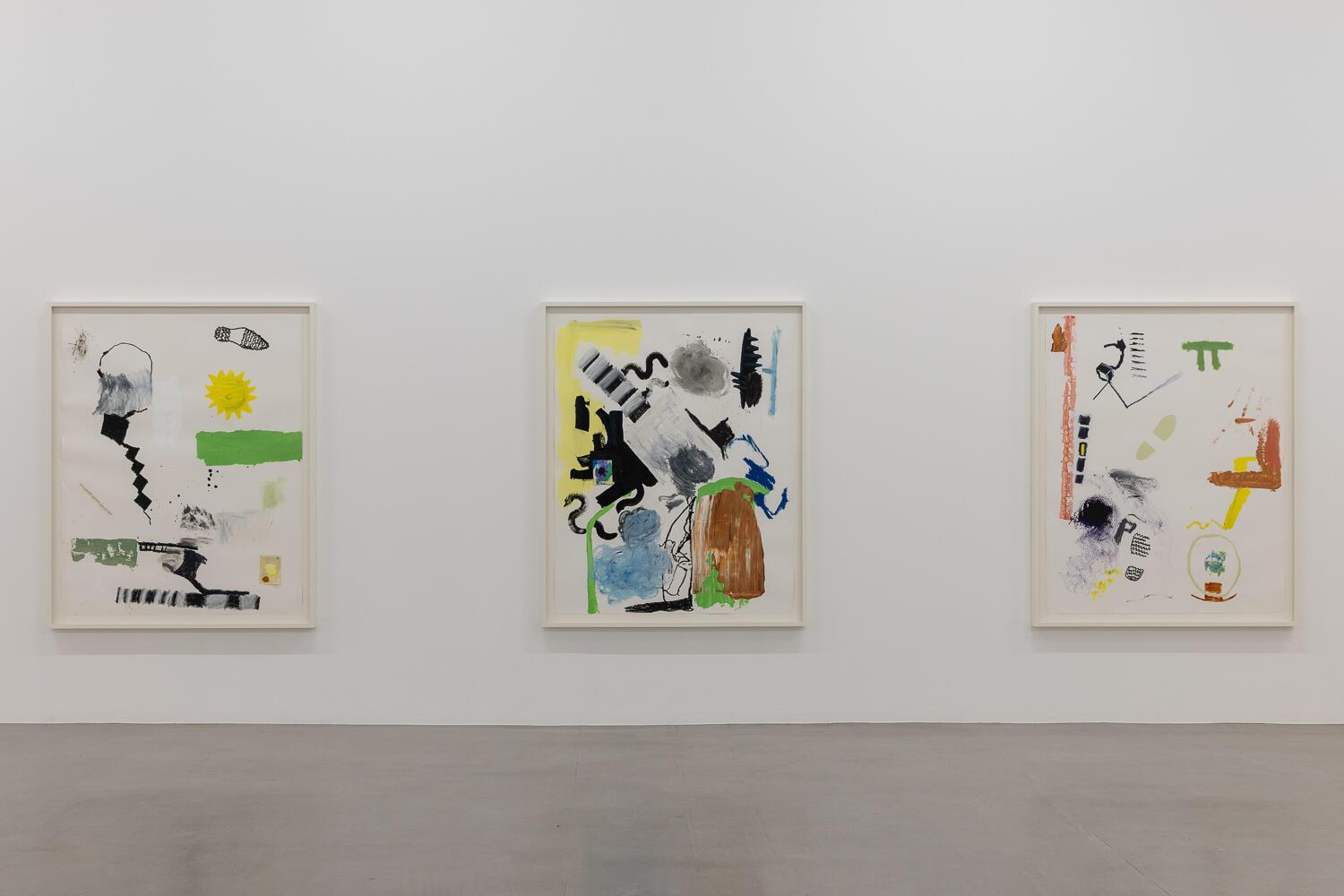
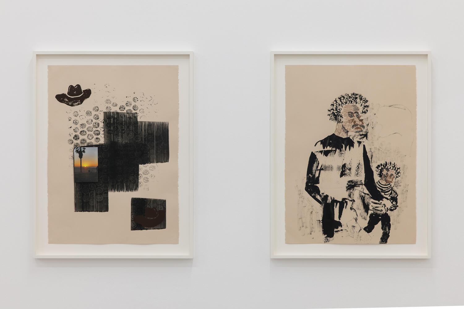
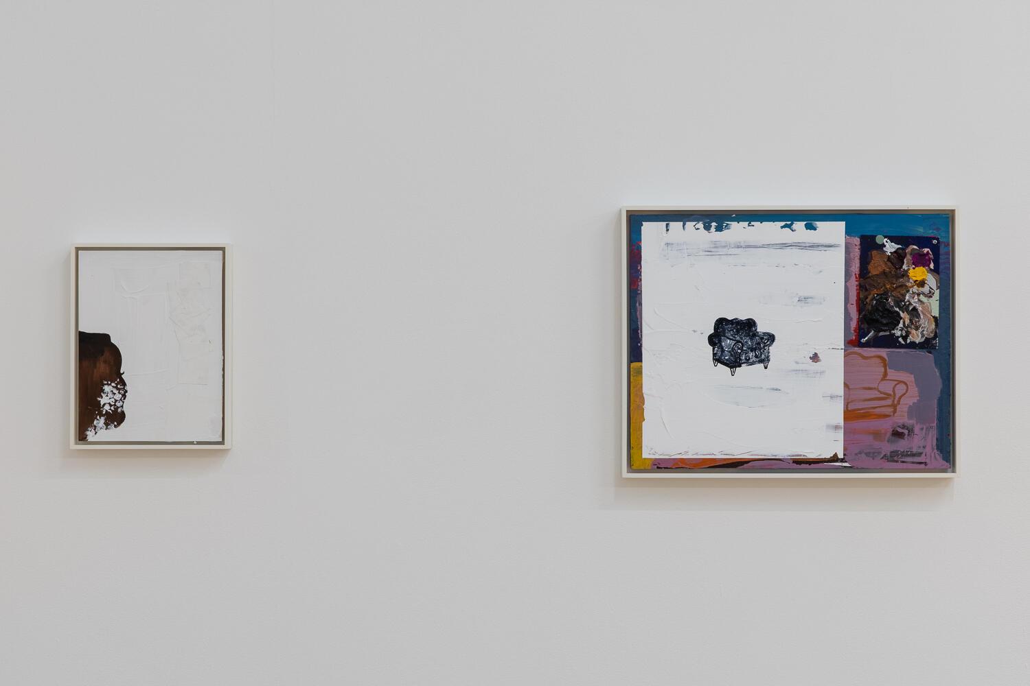
As well as Stetsons and cartoonish suns, plump armchairs and sofas are motifs that recur in both paintings and works on paper – scratched into thickly applied colour, or rendered in dotted lines that recall Phillip Guston. In the painting called Fate of the Animals no.2, Price quotes directly from Franz Marc’s 1912 painting The Red Deer. The white rhomboid form that Price deploys in a number of the paintings with greater or lesser emphasis, he has described as a response to the overwhelming whiteness of London. Negotiating this as a person of colour, Price has described himself as “dancing with that whiteness”.
Rianna Jade Parker’s excellent essay in the File Note to the show gives a concise and cogent view of Black art in America, focusing on the writings of Frank Bowling and beginning with the 1971 exhibition at the Whitney Museum Contemporary Black Artists in America. She ends by quoting Price: “They (this was in context to white viewership but it can also be applied to a general audience) want it (the art) to be easier for them to understand. They want the final answer. They want it to be already figured out. “He did this because he went to the Navy” or “he did this because he’s from the South”. I’ve been dislocated from my own roots. I don’t owe them location or context. I want the work to offer wonder, yet avoid being condensed to the politics around my identity.”
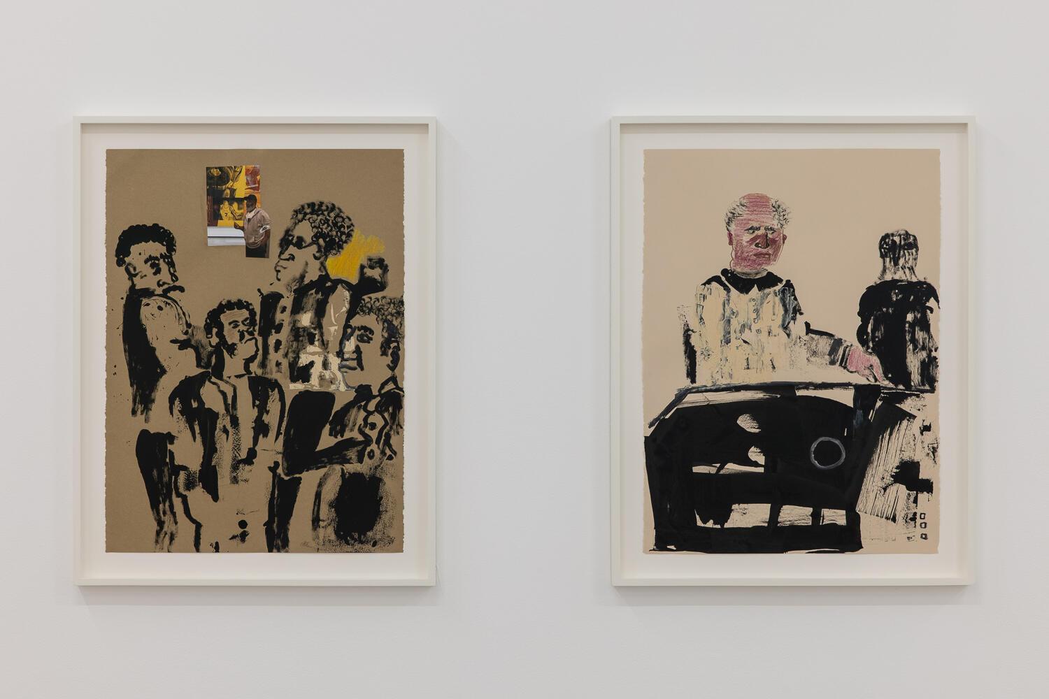
In the paintings on display in Gallery Two, a lexicon of abstract mark-making is to the fore, though a face in profile frequently appears, bottom left: sometimes fully rendered with close-cropped hair, at other times merely an outline, embedded within a composition. In Hold the umbrella tight while viewing my rain the profile is a snaking red line over the luscious blue ground, only determining itself as a head by the flick of an eyelash. One has a sense that this character is the observer, quietly present, but judging. Some works in the show are clearly based on observations from everyday life: a drawing of a man pushing a supermarket trolley and wearing a facemask, for example. Or the man walking with a child in a striped shirt, titled Always look both ways. Absolutely in and of its time, this work, as the artist is quoted saying, does not provide simple explanations of itself. Instead it deftly renders the messy complexity of an experience of life lived now, with humanity and a generous serving of pleasure.
Caroline Douglas
Director
Camden Art Centre, Arkwright Road, London NW3 6DG. Open Thursday-Sunday 11.00-18.00. Exhibition continues until 29 August 2021. www.camdenartcentre.org