


'Bridget Riley: Recent Paintings 2014-17' at David Zwirner London
- Posted:
- Friday dispatch
- Type:
- Read Time: 5 minutes
There are some spectacular painting shows in London at the moment: the Royal Academy’s exhibition Charles I: King and Collector is a feast too rich to digest in one visit. In the contemporary, Peter Doig at Michael Werner and Glenn Brown at Gagosian are both at the height of their powers after more than 20 years endeavour. But Bridget Riley’s exhibition at David Zwirner Gallery is a masterclass in the elegance and power of concision. More than 50 years since she made her name, Riley thrills by demonstrating that she is still testing the terms of engagement with the medium - with the same rigour, the same appetite for risk.
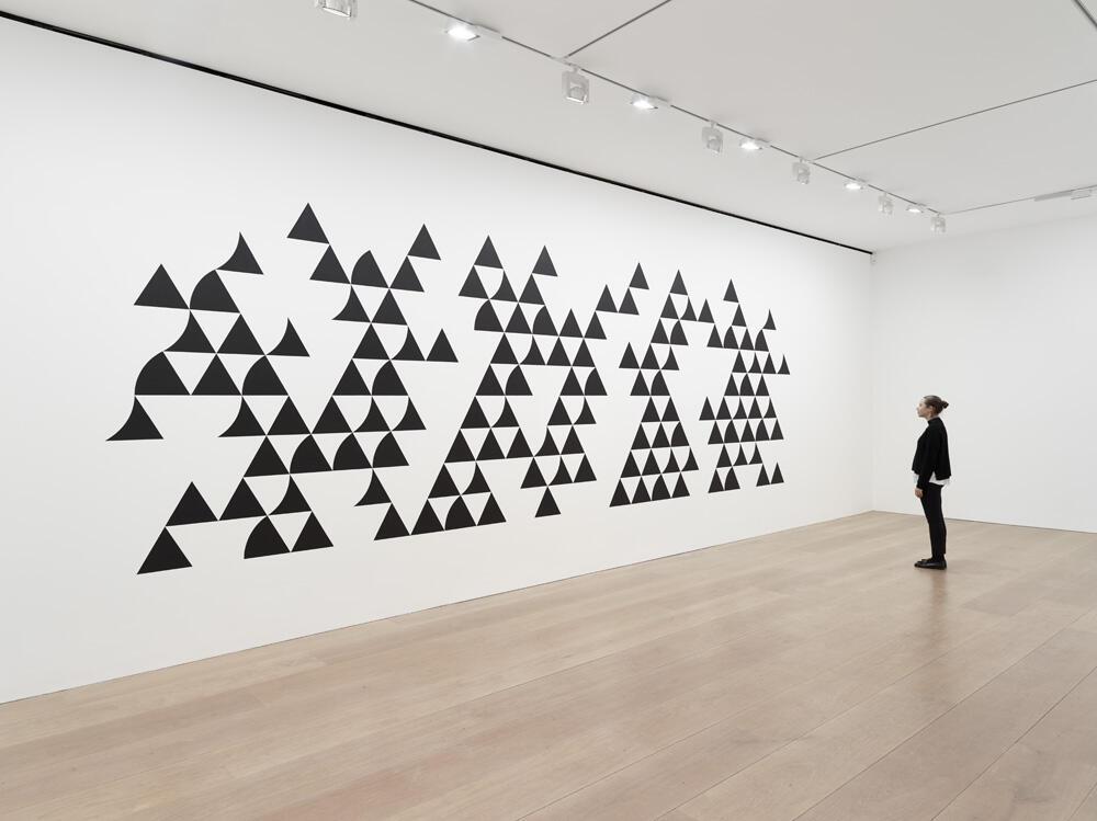
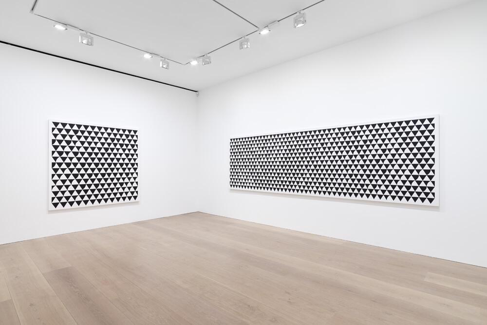
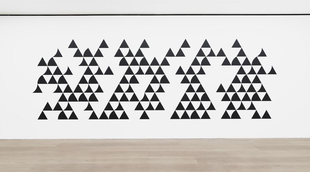
Riley has chosen to open the show with the grand wall painting Quiver 3, 2014. This takes the formal device of her 1962 field painting Tremor, and filters it through all the lessons learnt since. For me, it bears a particularly strong relationship to works in the Curve series that she began in the late 1990s. The Curve series is notable for its palette of green, blue and yellow, or the super-hot red, pink and blues that recall late Matisse cut-outs. But the point here is that Riley has afforded more autonomous existence to the individual elements of her composition.
In Quiver 3, each triangle of the composition is released from the overarching logic of the field and, like the cut-out elements of Matisse’s works, operates dynamically, with its own agency, as well as collectively. In the Curve series, this agency is especially emphasised when elements extend beyond the rectangle of the composition.
On the ground floor, there are only two other works after the wall painting. (The spareness of the hang forces greater concentration from the visitor.) These too take the triangle as their basic element, playfully putting it through its paces with alternating curved sides, so that serpentine ripples appear to animate the paintings. Look again and three dimensional forms can appear: it is still so true that no other painter makes one so conscious of the act of looking, of the operation of our equipment for seeing. The strong contrast of black and white produces a kind of luminosity, particularly at the edge where the colours meet.
Rustle 6, 2015 and Cascando, 2015 both bring the composition in from the sides of the canvas. Where the early 60s version took the composition to the edges of the support, implying that it might continue indefinitely – here the physicality of the triangle is emphasised by isolating, or compressing the composition slightly, on the white ground.
The talking point of this new exhibition is the return to black and white. Bridget Riley is still most closely associated in the popular mind with her op art, black and white works of the early 1960s. These strikingly original paintings were born out of her close study of George Seurat’s pointillist paintings. Though it might seem counterintuitive to compare Riley’s monochrome with an artist synonymous with the use of colour, the key here is the question of contrast. “As everyone knows” Riley carefully said, “black and white are colours.” They represent the most fundamental and dynamic contrast available to the painter, and allowed Riley to distil the sense of movement Seurat generated through colour juxtapositions.
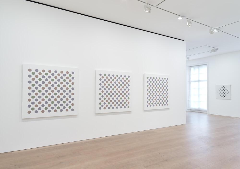
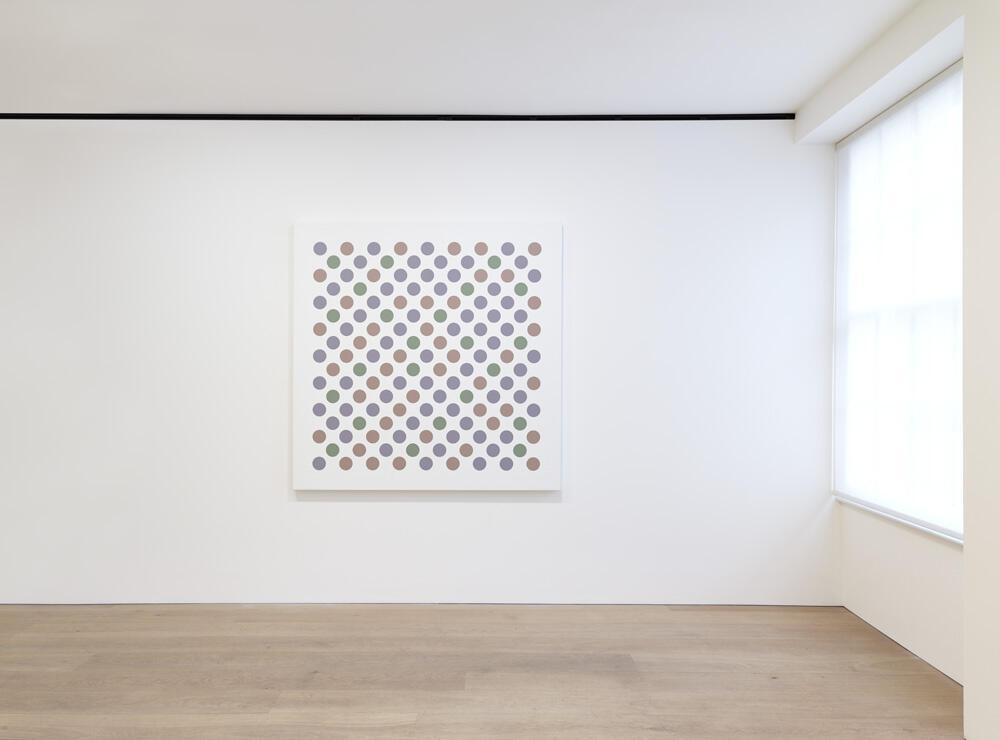
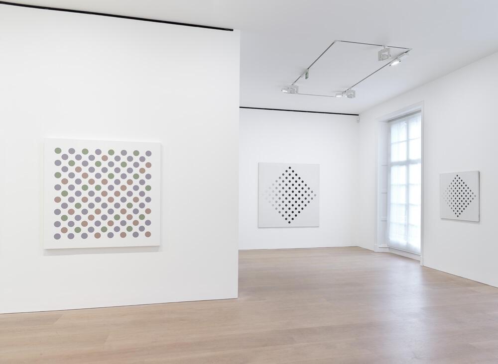
Bridget Riley has chosen not to include the 1960s black and white field paintings that are the departure point for the works on the ground floor here. But on the first floor she has hung Black to White Discs, 1962/65 and Study for Black to White Discs, 1961. Such is the precision of the hang that these are a strong statement in the overall argument of the show. In both works, a square formation of discs, graduating in tone from white to black, is tipped onto its point within the white ground of the canvas. Writer Eric de Chassay has pointed to these works in discussing the difference, in her early work, between the all-over, field paintings and these, as image paintings.
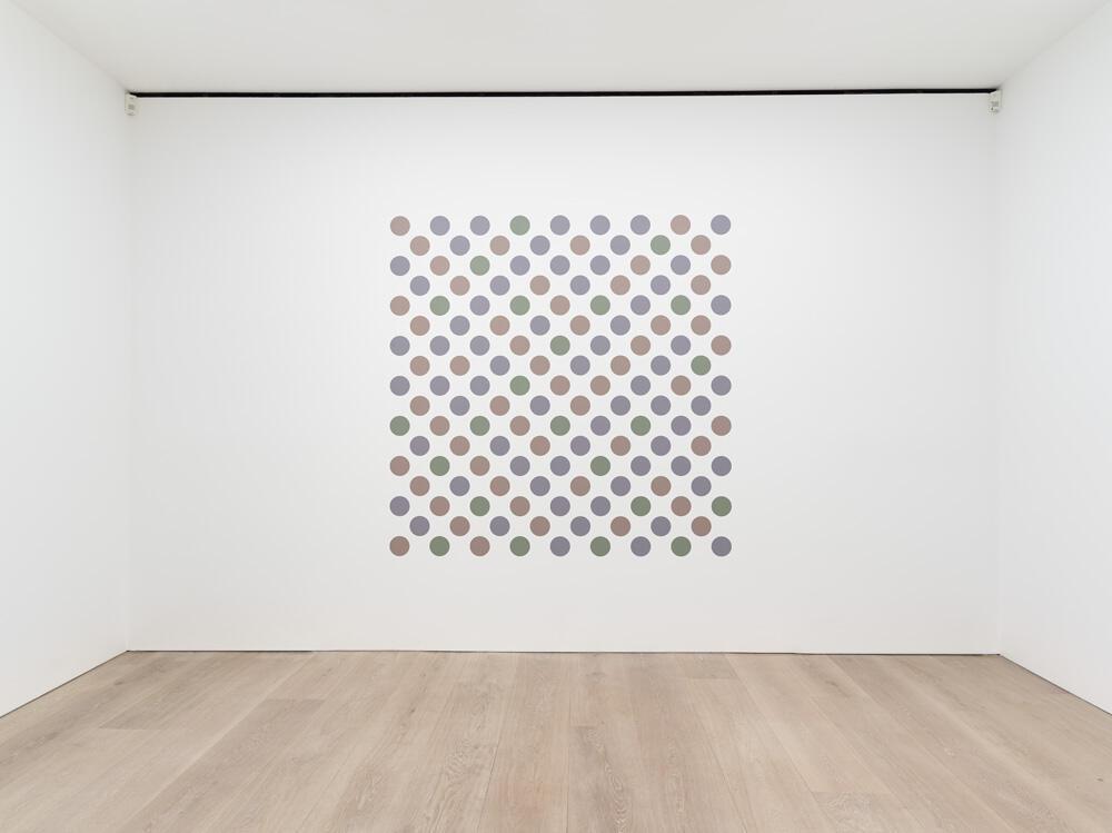
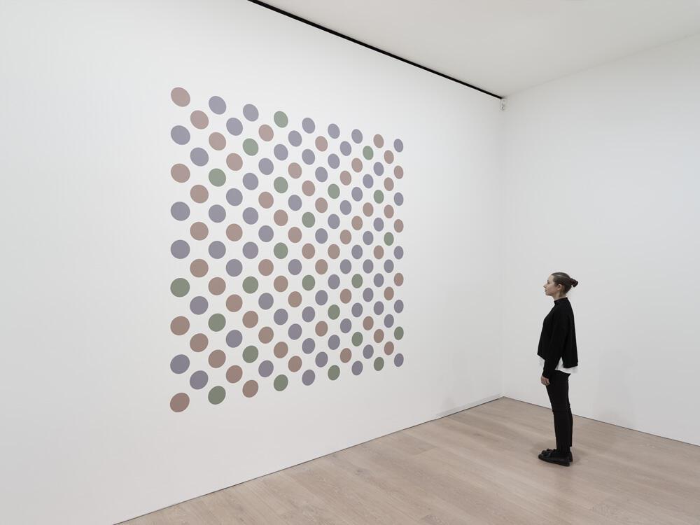
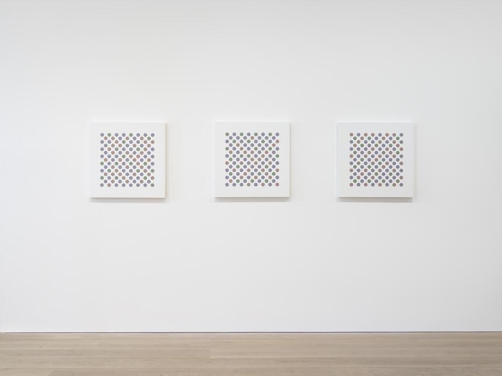
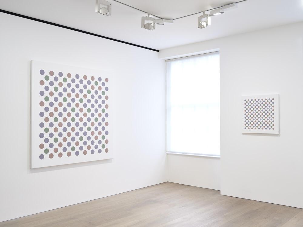
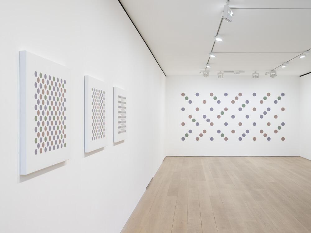
When one turns then to the new works on this floor, all titled Measure for Measure, one understands them as the square formation of discs, turned parallel to the edges of the canvas once more – distinct against the white ground. The palette in the whole series is the same as the dreamy, twisted curve painting Vapour, 1970: violet grey, green grey and orange grey. While the composition remains the same from work to work, the play of colours changes each time. “It’s the same game, with a different hand”, Riley explains. Constant to this series is the occasional left to right diagonal of single colour discs that, like the meter in music, underlies the ‘melody’ of the colour variations.
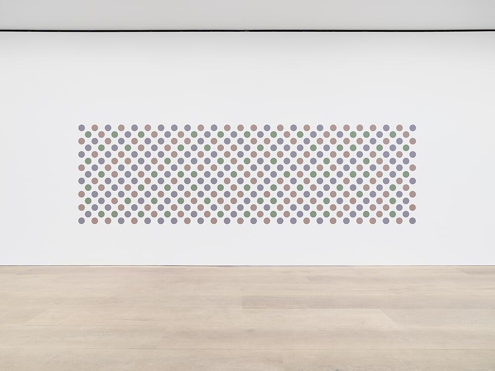
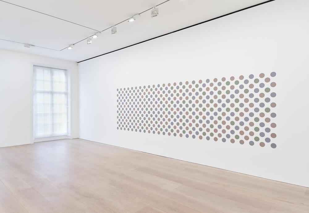
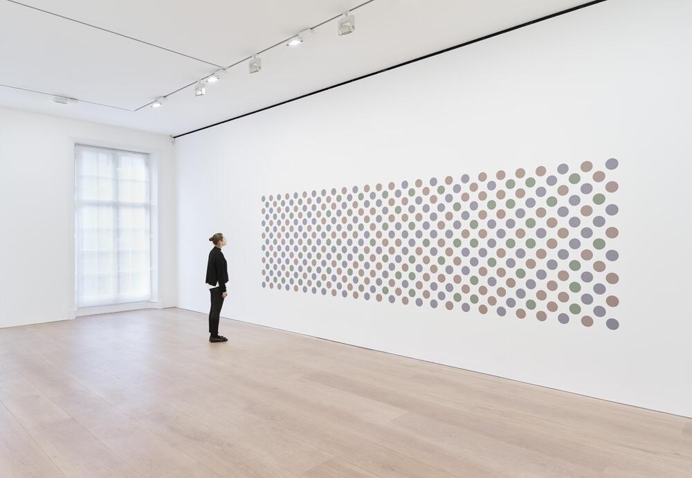
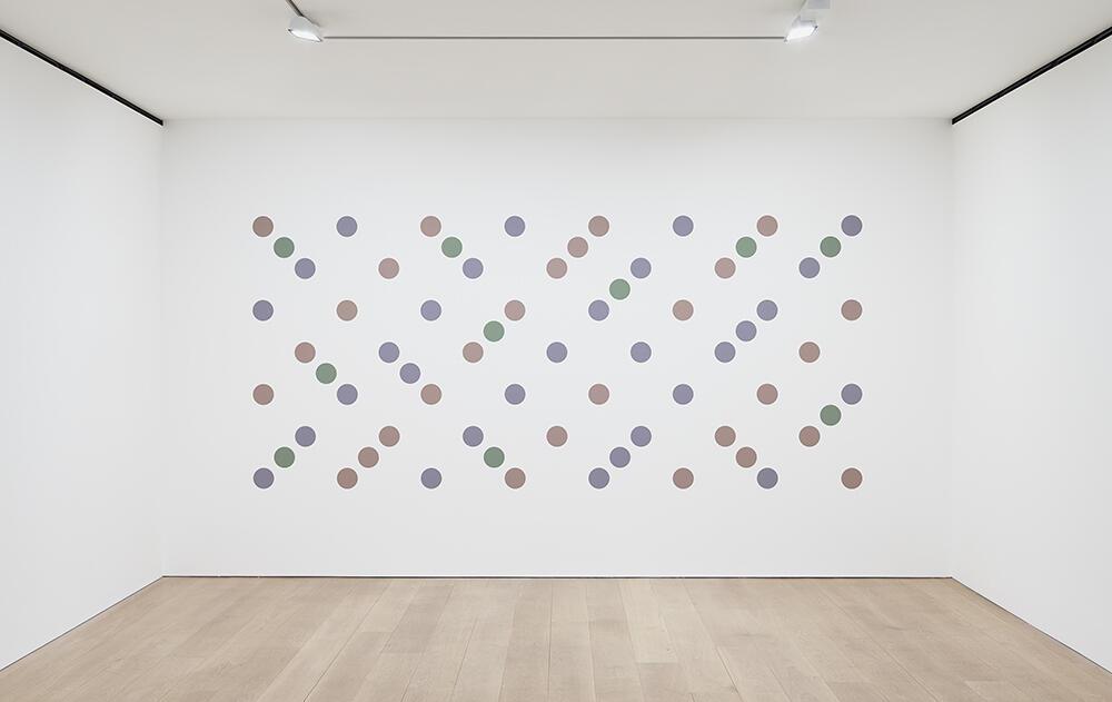
Up on the second floor, the last work in the show is also the most recent, only resolved over Christmas. Once again a large-scale wall painting, it brilliantly complements the show’s opening gambit. For here again, Riley has loosed the basic element of the composition, in this case the disc, from the previous organising logic and allowed it to operate quite differently. As with Quiver 3 on the ground floor, the composition makes the wall an active component, producing a spatial play that can bring the white areas between the painted elements forward, tessellating the entire surface, or make the white recede, producing a floating, dancing sensation.
This show demonstrates mastery of a different order. An intellectual precision combined with a playfulness that is completely beguiling. Required viewing.
Caroline Douglas
Director
David Zwirner, 24 Grafton Street, London W1S 4EZ. Tuesday - Saturday 10.00 – 18.00. Exhibition continues until 10 March 2018. www.davidzwirner.com